![]()
Penguin Awards:
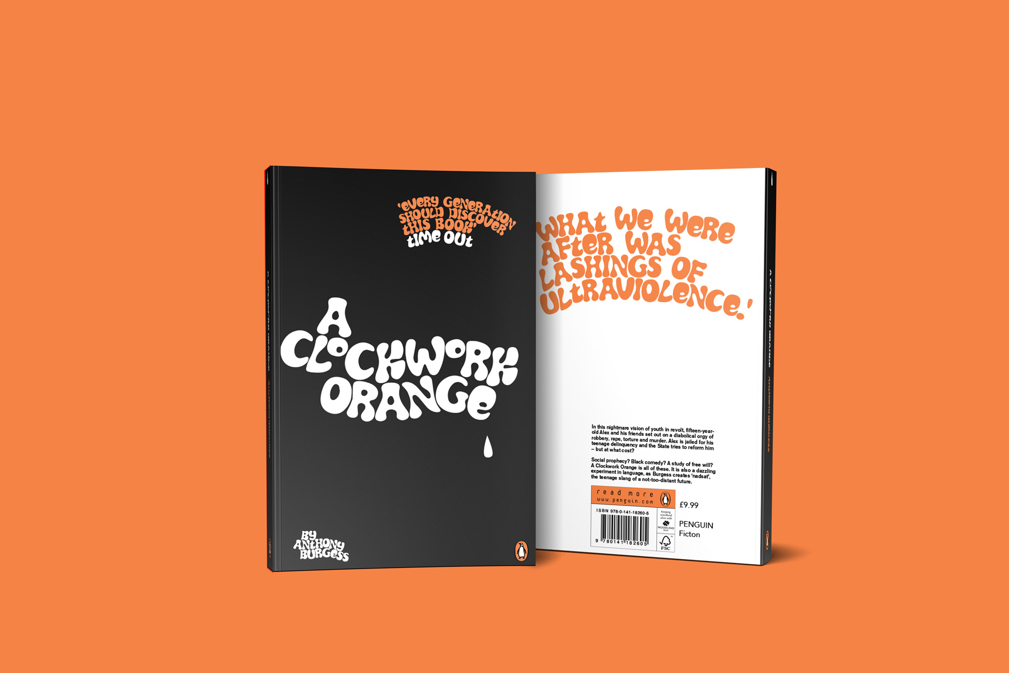
‘A Clockwork Orange’
A Clockwork Orange is as dazzling and inventive to new readers today as it was when it was first published half a century ago. The story is well known both in celluloid and print so it is essential to come at it from a fresh angle.Try to design a new cover for a new generation of readers, avoiding the obvious clichés. Originality is key.
Response
The milk laced with drugs is a prevalent theme throughout the novel because it shows how a pure and clean drink is warped with outside agents, similar to the youth that drink it. I wanted to create a cover that flowed from front to back engaging with the reader, making it more than a static cover.
When choosing a typeface I discovered the psychedelic font ‘Synthemesc’ which was originally used for a mock milk bar in New York. The typeface was used at the start of Stanley Kubrik’s 1972 film whilst the main characters are sat in the Korova Milk Bar.
I wanted the link between the film to engage with a wider audience and encourage people that have watched the film to read the book. My original plan was to replicate the back round of the milk bar, however as my work developed, this idea became too crowded.